
The History of Architecture in Sections:
Selected Works of History of Architecture (Year 1, BArch, Spring 2023)
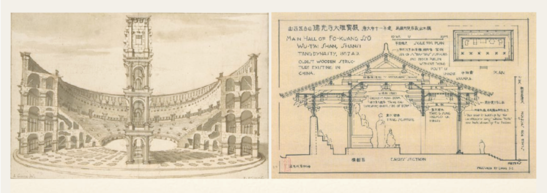
Teachers: Zhou Minghao, Li Yingchun
Teaching Assistants: Zhou Chao, Qiu Jiayue
Selected Works
01
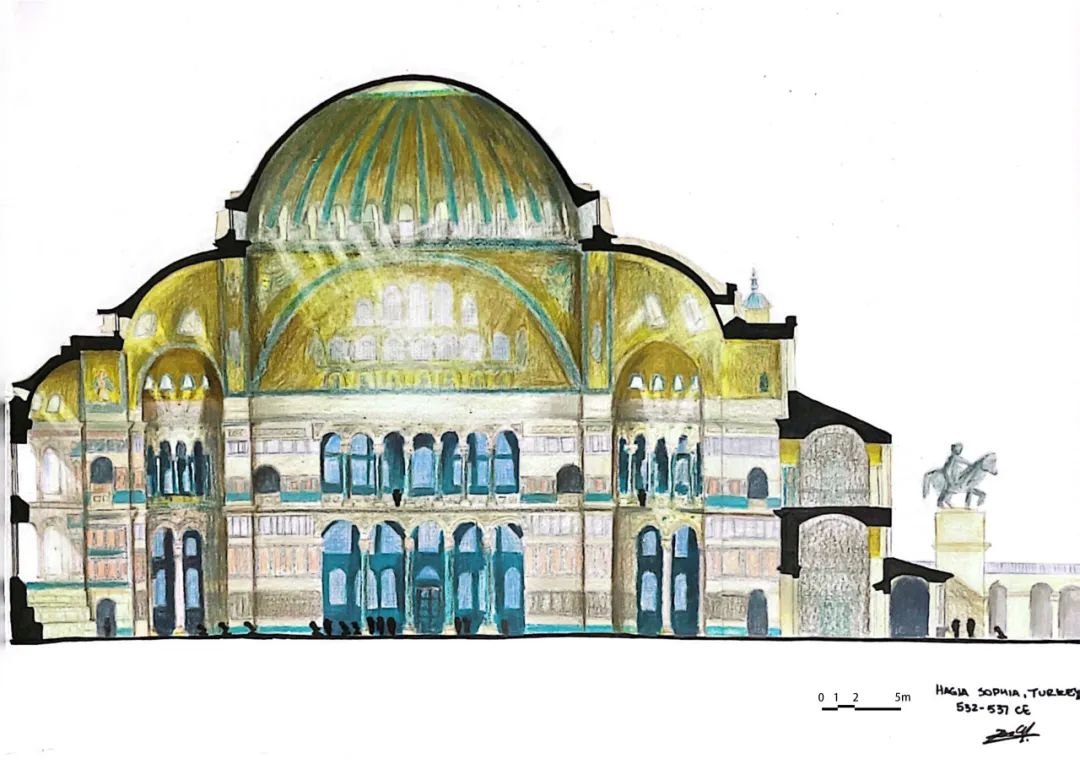
Longitudinal Section of Hagia Sophia (Church of Holy Wisdom), Istanbul, Turkey, 532–537 CE

BY
Zoe Chen
Zoe Chen is an architecture student from Argentina who enjoys reading and dancing. She desires to discover more about what the world has to offer.

Object Description
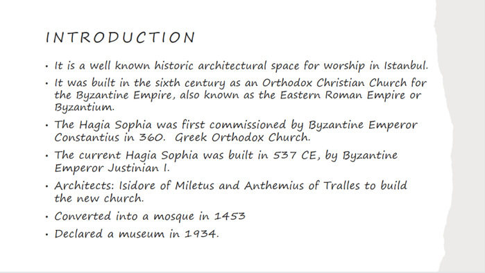
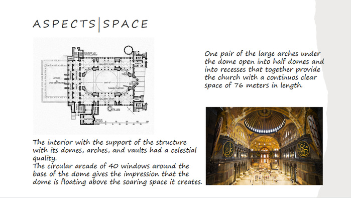
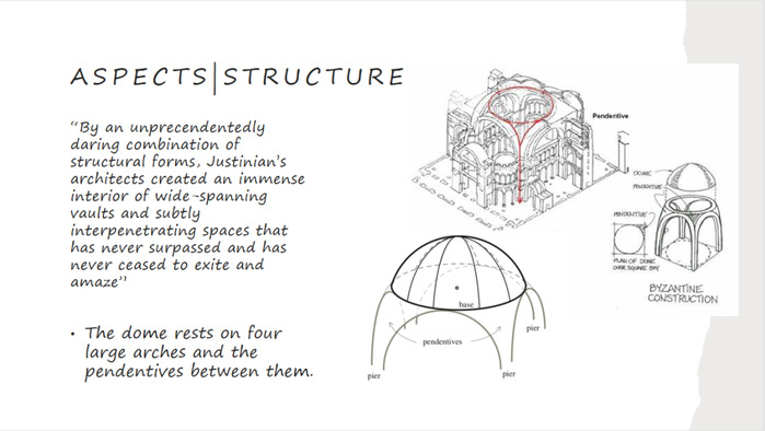
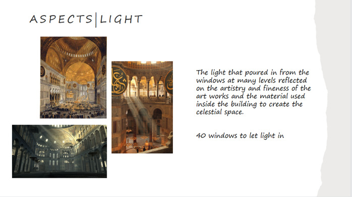
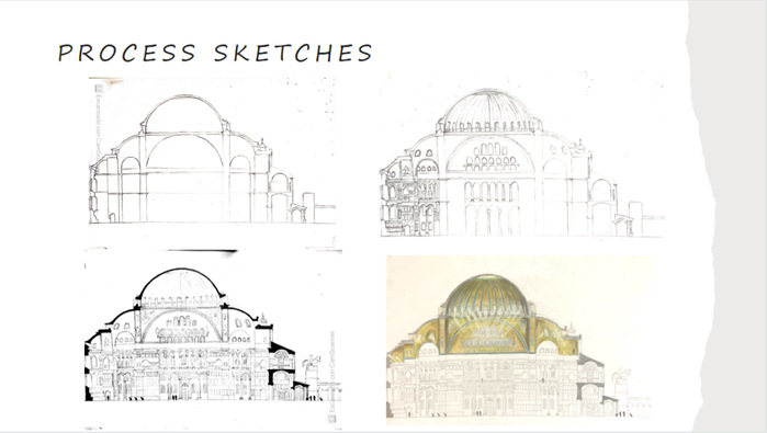
The church of Hagia Sophia is known for its dome. It is not only about its grandeur scale, its intricate structure but also about the magnificent light control which brings the architecture to life. My work aims to present how the dome magnified and illuminated the building. In addition, it illustrates the complexity of architecture inherent in the structure of domes, pendentives, and piers.
02
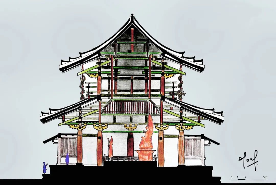
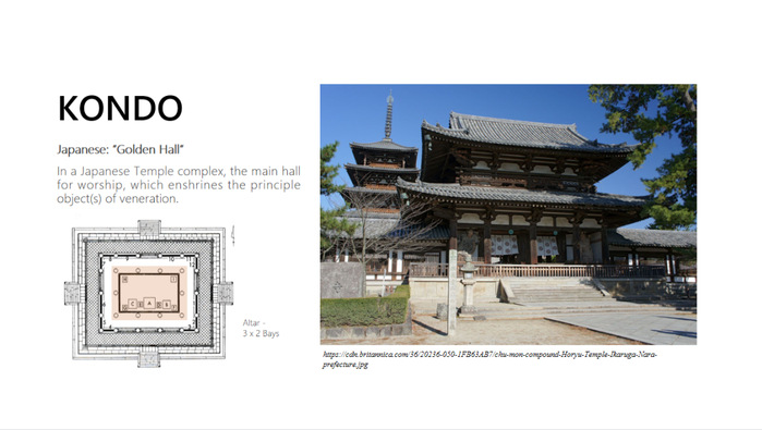
Cross Section of Kondo (Golden Hall) of Horyuji, Nara, Japan, 650 CE

BY
Torry Taschya Sutartho
Torry Taschya Sutartho, coming from Indonesia, is passionate about using her creativity and skills to produce designs that not only appear aesthetically pleasing but also have a positive impact on society. She believes that architecture has the power to influence how people live, work, and interact with their environments, and she is committed to using her skills and knowledge make a difference.

Object Description
The Kondo of Horyuji Temple, situated in Nara, Japan, is the world's earliest surviving wooden structure, dating to the early 7th century C.E. It is an exceptional example of ancient Japanese architecture, featuring a post-and-beam structural system. The timber-frame construction is responsible for transferring the roof's weight to the earth through the posts and beams.
The cross-section drawing reveals the building' s structural system and space utilization, highlighting its cultural and religious significance. The drawing depicts the structure’s horizontal and vertical components in green and brown, respectively, showing their crucial role in supporting the roof’s weight. To illustrate the depth of space, varying line weights and color tones are used, with thicker line weights used for structures that are closer and darker tones used for structures that are further away. The drawing also highlights the visitors' behavior and the manner in which light penetrates the building through roof gaps and entrances.
03
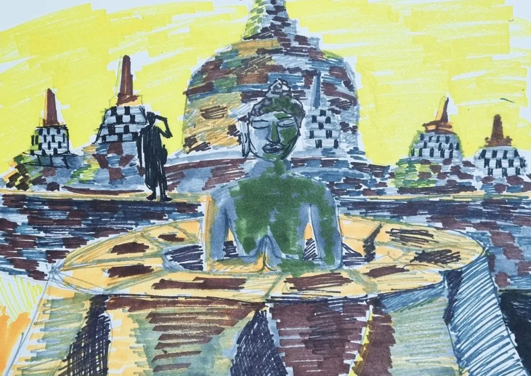
Borobudur, Jogyakarta, Java, Indonesia, 842 CE
BY
Son Junho
Son Junho was born in Gwangju in 1999. After dropping out of his electronic engineering programme in South Korea, he re-enrolled in the Department of Architecture at Tongji University. He enjoys all kinds of fun. Whatever looks like fun, he tries.
Object Description
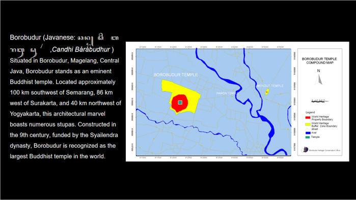
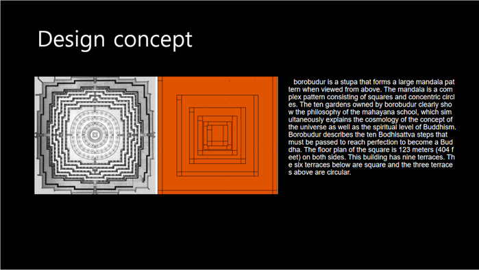
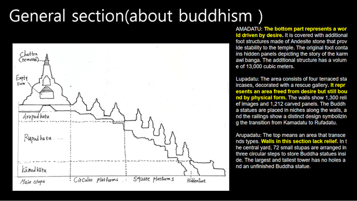
Borobudur, an Indonesian Buddhist temple on the island of Java, is made of volcanic rock and measures approximately 123 m on each side. Through depictions of human figures and Buddha statues, I intend to represent its scale and the harmonious integration of nature and time, despite its immense size. Although composed of a single material, Borobudur exhibits a diverse array of colors, which are particularly captivating at sunset. In addition, the presence of verdant moss on the volcanic rocks enhances their charms and emphasizes their connection to the environment.
04
Sections of Notre-Dame de Paris (partial), Paris, France, 1163–1344
BY
Prangsai Vichiantassana
Prangsai Vichiantassana is 19 years old and from Chiang Mai, Thailand. She has a deep passion for sustainability and architectural design. She is looking forward to becoming a creative person who can help improve the quality of life for humans.
Object Description
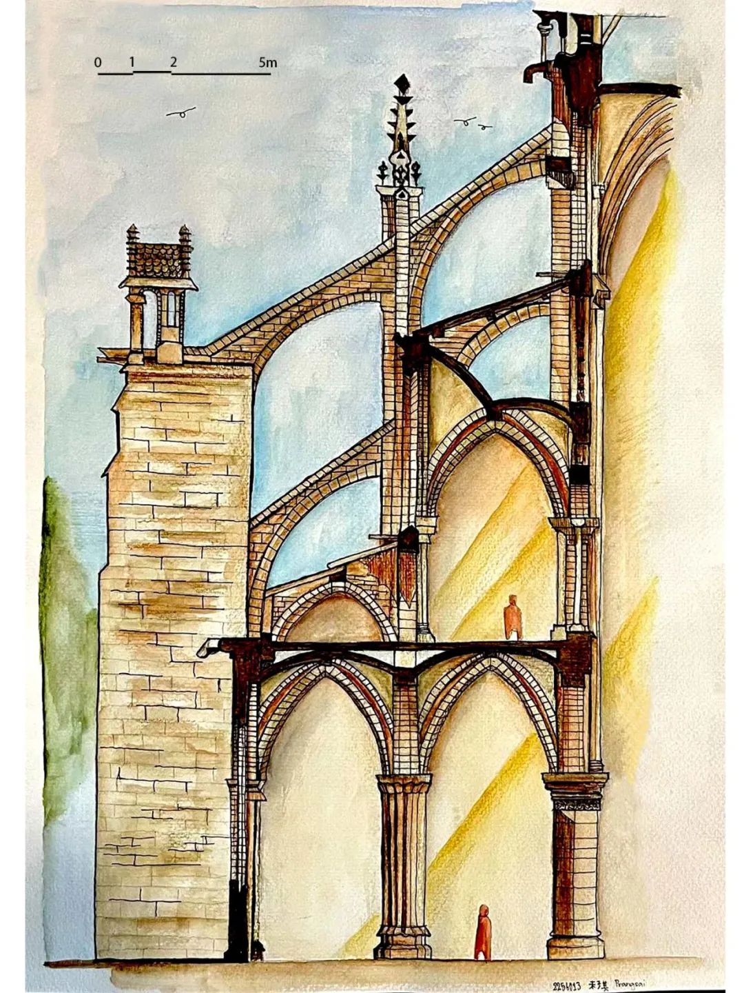
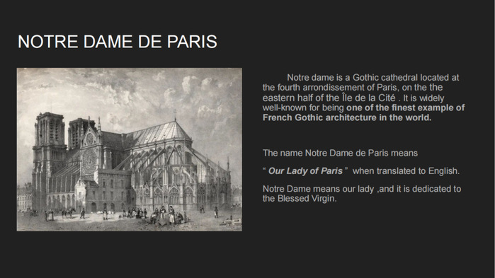
At Notre Dame de Paris, one of the most important features is the flying buttresses, along with interior windows that invite natural light inside and create a heavenly atmosphere. Light is considered one of the most important elements of Gothic cathedrals; as it represents the link between the earthly and the heavenly. In this work, I emphasized both features by depicting the the interior and exterior in distinct colors. The interior space is represented with a brown gradient and golden-yellow lighting to convey a sense of holiness, similar to a light from heaven. The exterior environment is represented by natural colour, including a light blue hue, greenery, and birds. Another reason to portray a clear boundary between the interior and exterior is that some areas under the flying buttress are semi-open spaces, where people can be sheltered.
Regarding the building, the concept behind the color scheme is to replicate the actual colour of its materials as closely as possible. Limestone is represented by the beige colour along with the other two shades of brown, brown with a red base and brown with a yellow base, to create the details of an aged building.
05
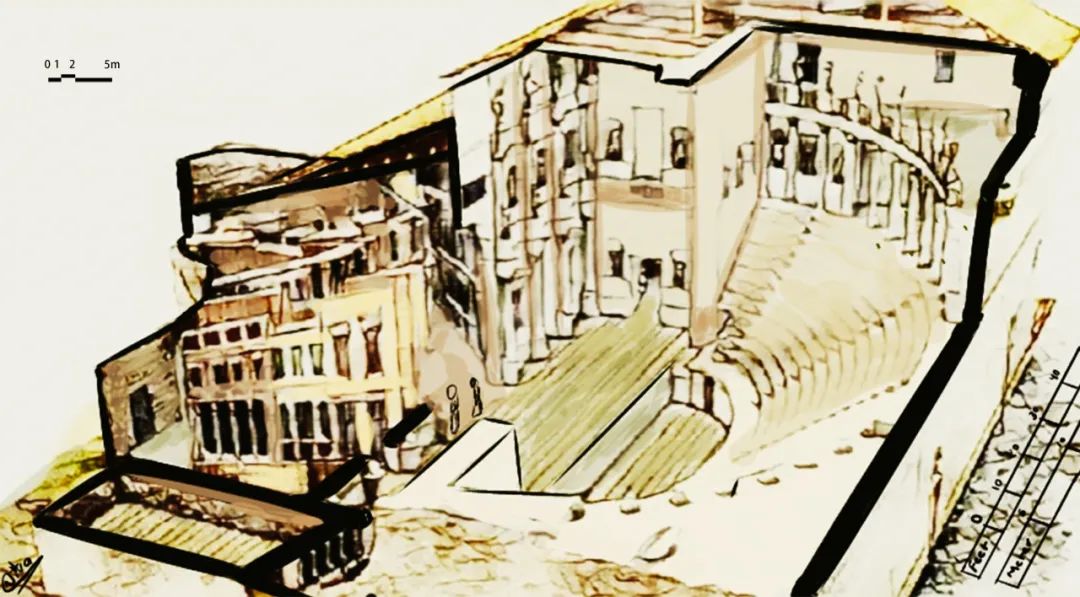
Profile axonometry of Teatro Olimpico, Vicenza, Italy, 1580–1585
BY
Niva Shrestha
Niva Shrestha comes from Nepal. She has a profound love for art, design, and creativity. Exploring the world of artistic expression fascinates her, and she is constantly inspired by the power of creativity. As she embarks on her journey, she is eager to nurture her passion and unlock new avenues of self-expression.
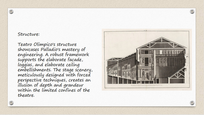
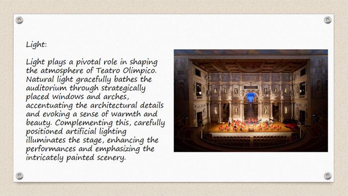
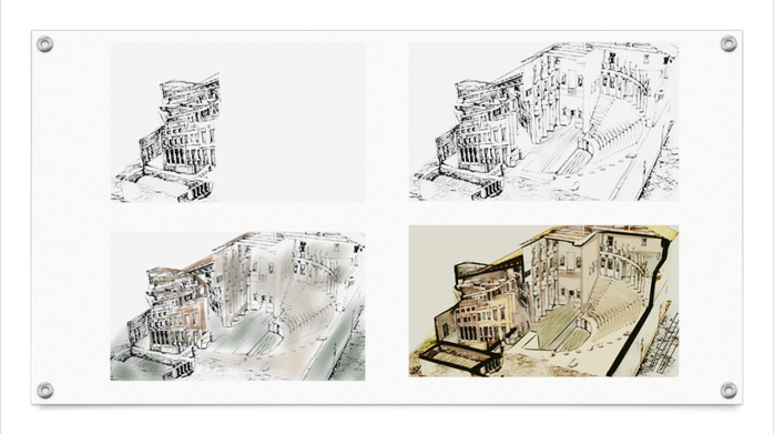
Object Description
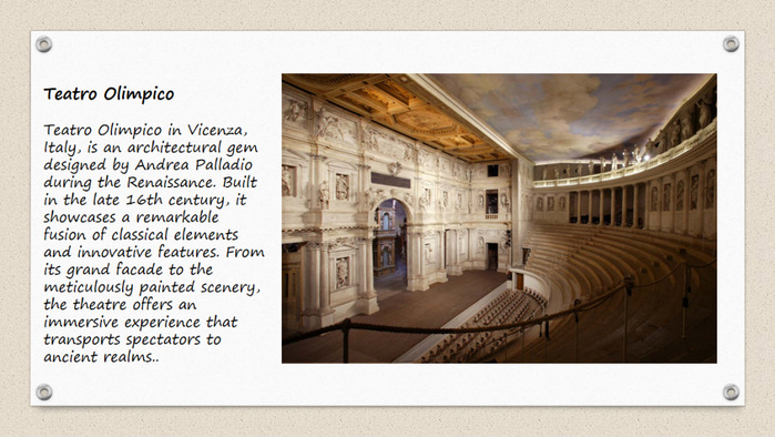
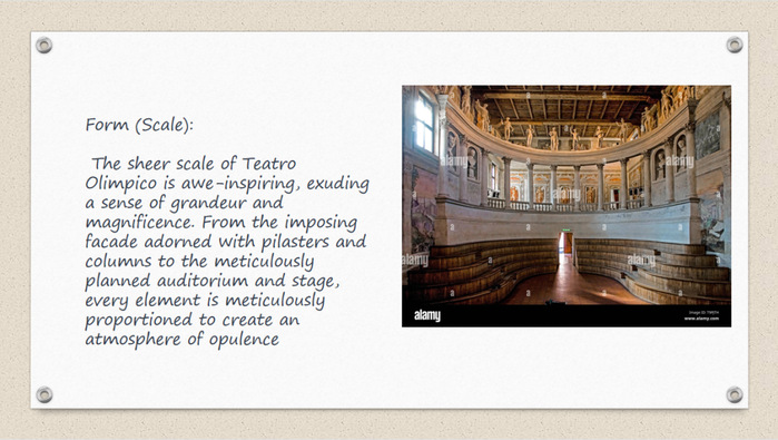
In my work, I intended to capture the architectural grandeur and highlight the captivating details of the structure by using the vibrant and expressive qualities of watercolour. I depicted the building section with careful attention to its intricate architectural details. The Corinthian columns stand confidently, demonstrating their timeless elegance. The interplay of light and shadow on the façade adds depth and brings out the subtleties of nuances.
To enhance the visual impact of the drawing, I experimented with colour interaction. The watercolour medium enabled me to create subtle gradations and blends, giving the composition a sense of depth and vibrancy. The use of contrasting tones and complementary hues adds visual interest and highlights the architectural intricacies.
06
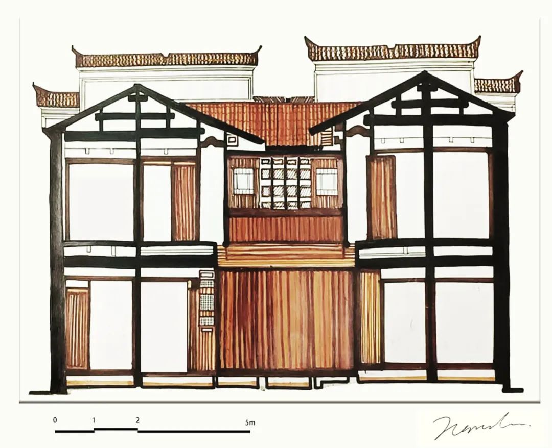
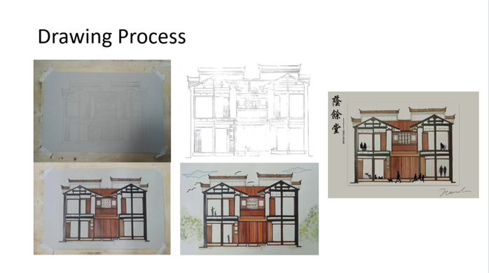
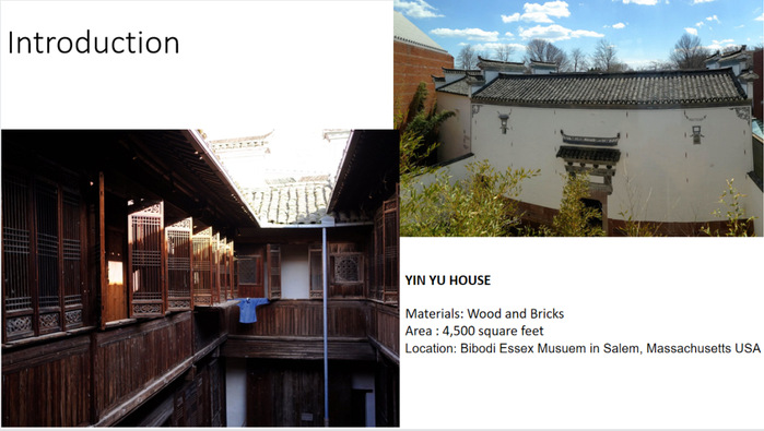
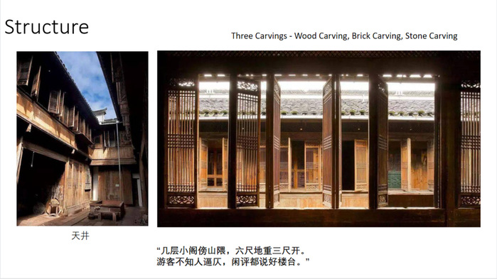
Section of Yin Yu Tang House, Peabody Essex Museum, Boston, USA, initially built in southeastern Huizhou region, China, late 18th century

BY
Naresha Loh Pey Yue
Naresha Loh Pey Yue is from Malaysia. She likes diving, swimming, scuba and other water-based activities. She pursues to explore the unknown as her design elements.

Object Description
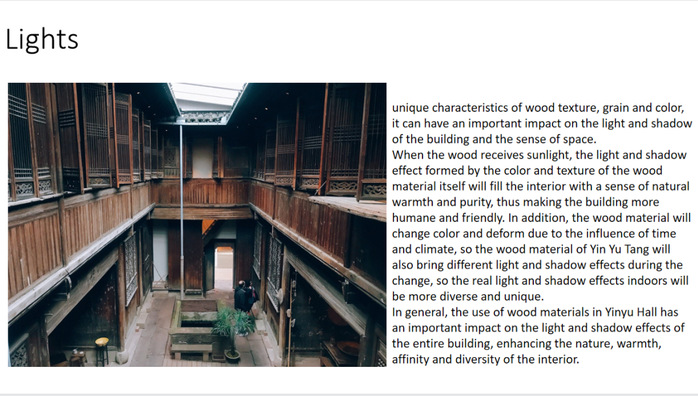
Brick and wood are the primary construction materials of the Yin Yu House, and the colour of this work was inspired by the structure. The unique characteristics of wood texture, grain, and color can have an important impact on the building’s light and shadow and the sense of space. When the wood is exposed to sunlight, the light and shadow effect created by the color and texture of the wood material itself will imbue the interior with a sense of natural warmth and purity, thereby making the building more humane and friendly. The roof is one of the most prominent elements of this building.
07
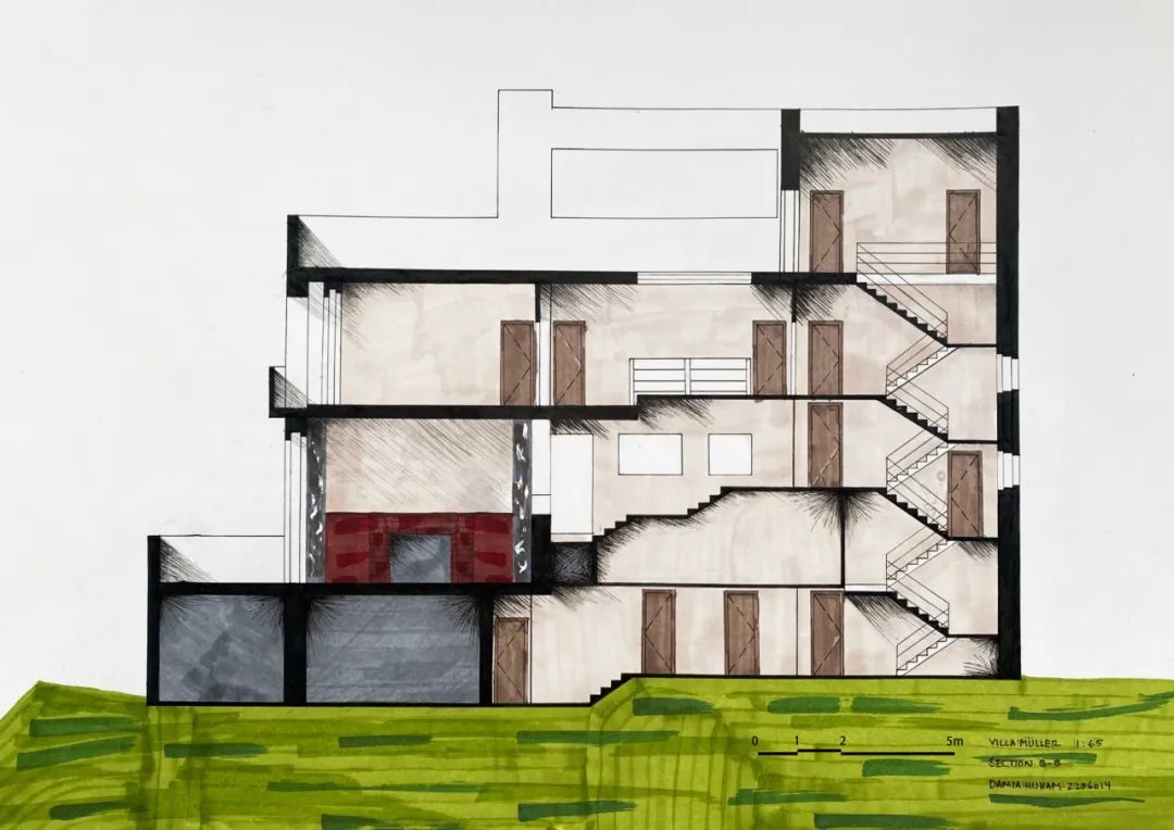
Cross Section of Villa Müller, Prague, Czech, Adolf Loos, 1930

BY
Damia Hisham
Damia Hisham is an architecture student from Malaysia. She is fascinated by the intersection of culture, history, and technology intersect in the design of buildings and public spaces.
Object Description
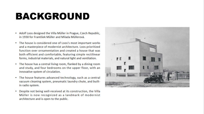
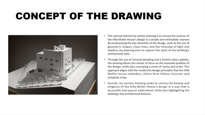
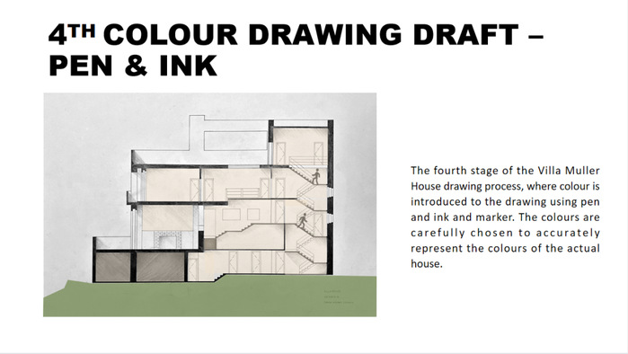
The Villa Müller in Prague, designed by Adolf Loos in 1930, is a modernist masterpiece with clean lines, industrial materials, and natural light and ventilation that prioritizes function over ornamentation. The section drawing aims to emphasize the use of geometric forms, clean lines, and the interplay of light and shadow. The use of verdant ground signifies the natural environment, whereas the use of clean lines illustrates Villa Müller's innovative approach to form, function, and simplicity.
08
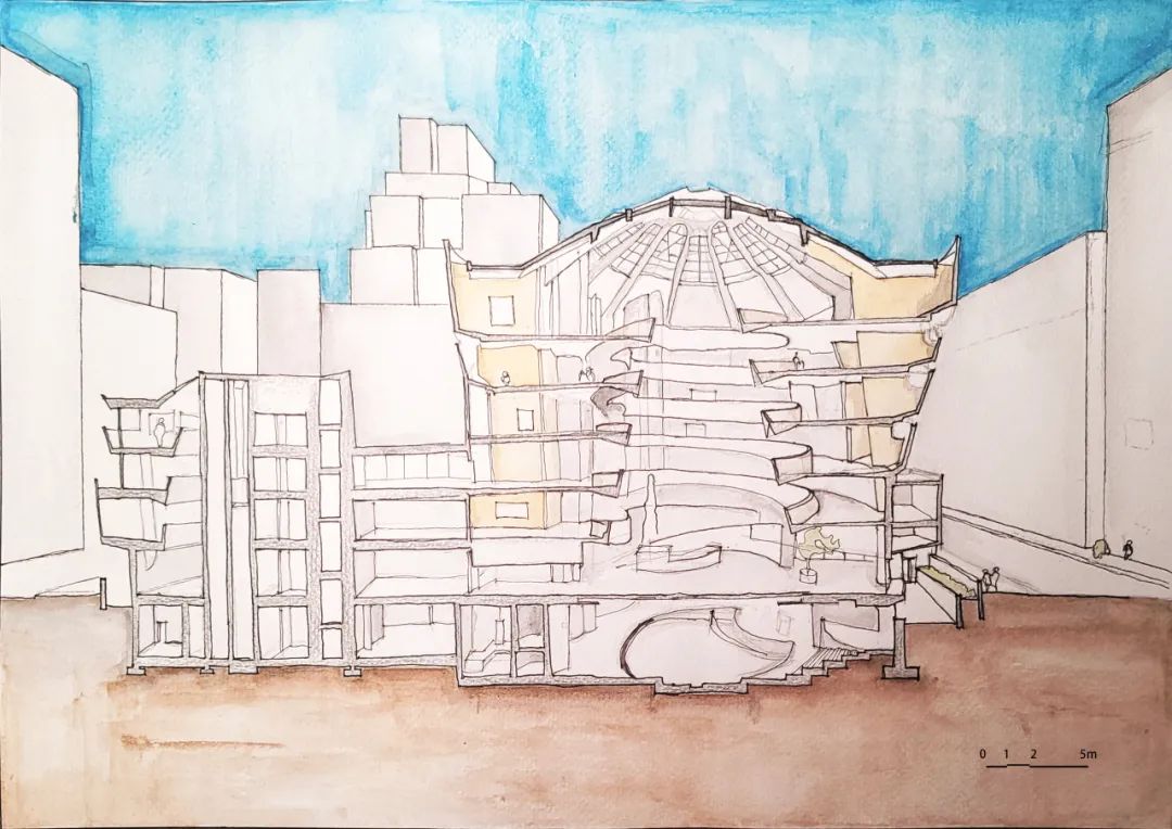
Cross Section of the Guggenheim Museum, New York, USA, Frank Lloyd Wright, 1956–1959

BY
Toeng Kok Heang
Toeng Kok Heang is an architecture student from Phnom Penh, Cambodia. He believed that the history of architecture plays a significant role in shaping architecture both then and now.
Object Description
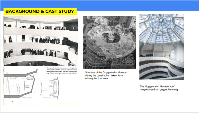
Solomon R. Guggenheim Museum in New York is designed by Frank Lloyd Wright. It was restored in the year 2006. The main design concept of this building is a cylinder-shaped ramp that serves as the primary interior utilization space.
In this work, I use three different thickness of fine liners to create space depth, differentiate materials, and indicate different positions of the subjects. Different hues of color are used to distinguish between construction materials and environmental elements. I tried my best to achieve a straight line on the section by drawing it freehand, while also keeping the structure right to scale. I also use various toning to represent the interior lighting effect. As there is a large glass dome roof in the center,the central area is brighter than the borders. I felt compelled to include human figures, greeneries, and the surrounding environment in order to convey a sense of scale and space.
 ABOUT US


